Flat UI Colors is a website which gives people the colour codes for trending App colour pallets. This website is very useful as It will help make my App look current and up to date as I will be using official colour pallets for apps. I will be using this website to guide me on my colour choices throughout my app, VR and AR design as all of them will need to be linked and colour is a useful way to do this.
Monthly Archives: February 2017
Augmented Reality
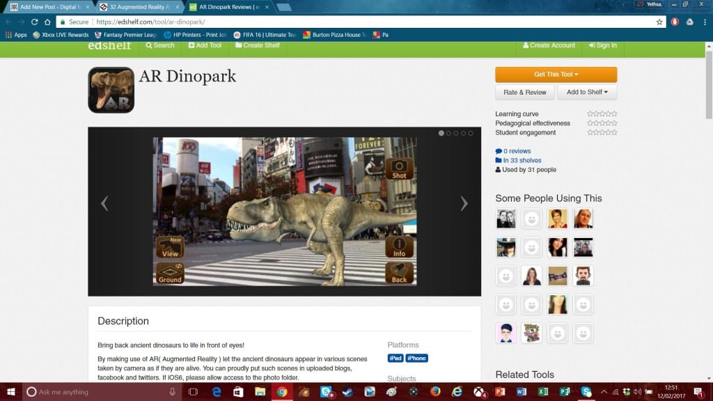
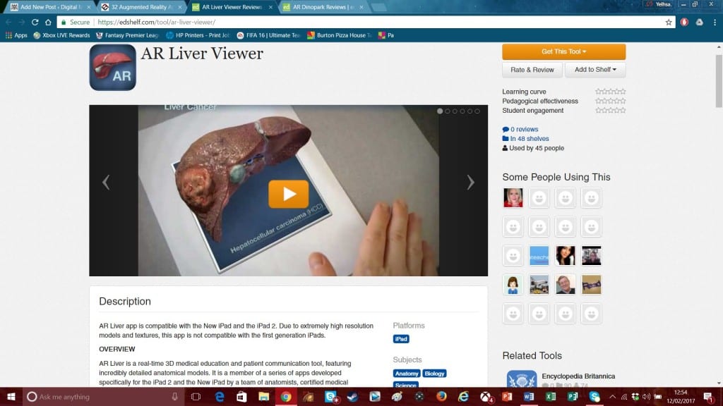
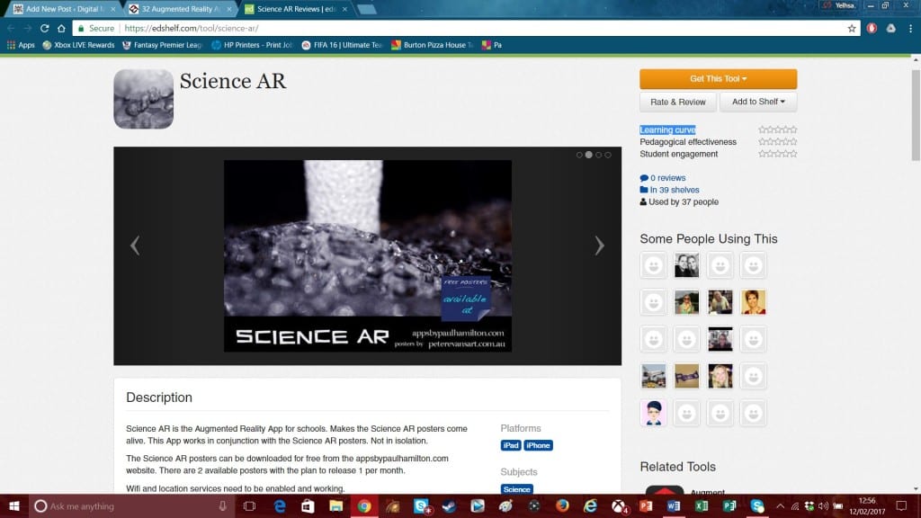
Augmented Reality (AR) is a fun way to bring a standard room or object to life. The software uses a smartphone’s or tablet’s camera to record an object and projects a 3D image onto it. There are many educational apps that use Augmented reality, here are a few examples of these apps.
All of these app’s bring their particular subject into a new, fun and modern way of teaching. They are all easily accessible as pupils only have to download the app onto their phones to get this experience. The limited ability of these types of app’s is the lack of information on their subjects. They all cover the very basics of each subject and let pupils to look into what a liver or Dinosaur would look like. Apart from this these App’s don’t offer much more. Taking from this I will still use Augmented reality as part of the package of my project. I will combine the best parts of Virtual reality, Augmented Reality and APP based learning into my package. They way the Augmented reality will work is a pupil will be able to watch a certain battle or get a mini tour around famous historical landmarks. The virtual reality element will allow people to live these events in a virtual space and react with them. Finally the App will bring all this content together and allow the pupils to explore past events and places in more detail. There will also be mini courses included in the App, similar to the ones shown by Khan Academy.
Human History Timeline
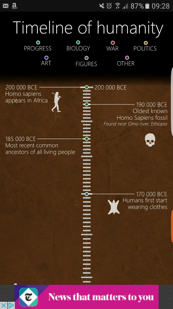
This app is a very heavily detailed timeline of all of human History. It contains the key dates and events of our whole past, from the emergence of Homo-sapiens in Africa, to the founding of our first city Jericho, To the Rise of the Roman Empire, to Colonisation and the Moon Landing. Obviously it is impossible to show every single event in our history however it covers a lot of events (be in brief detail) and it was very interesting to look at our past on a huge timeline. It even goes forward in history to predict future events such as the return of Haley’s comet and the next ice age.


Taking from this I will myself create a timeline of Human history from start to finish. I will most likely contain the same amount of detail as this app. This is because it will be impossible to add more events and detail onto the phone screen without making it un-readable. However I will add an interactive part to the timeline. If a user wants to learn more detail about an event they will be able to click onto the event and they will be redirected to another page giving them more detail about that part of history.
Existing Material Aimed at my Age Group
MindSnacks:
 MindSnacks is an app focused towards children aged between 11-14. This app helps children to learn foreign languages. It has a simple colourful layout and is simple to understand and follow. Due to the nature of the audience colour is a vital part of development of any software focused for this age group. This app uses colour very well as the app looks visually exciting and interesting. The use of animals also engages this younger audience as it adds a more friendly feel to the learning experience.
What I will take away from this app is its use of colours and animals which help engage the younger side of my target audeince. For this side of my experience I will make sure the app is vibrant and exciting so the younger side of my audience are excited about the software and learning history.
Khan Academy:
This App is an educational tool is aimed to all ages. it changes its layout and information in accordance to the level of development the child is in. This app allows people to learn any subject from History to science to English. On it’s website it gives the user a huge amount of choice into the subject they want to learn and study. For example in the history part you can select what era you want to look at e.g. Ancient Greece. After selecting this subject the webpage shows a YouTube video at the top giving a brief over view of this period and then further down the page pupils can go into a lot more detail. The layout is very simple ad easy to follow and the text is spaced out so it is very easy to read. The web page also gives the user a mini timeline at the side of the page to allow them to focus on certain aspects of the subject without being overwhelmed by information. Their app also follows this style showing coherence and an easy understanding of their content.
https://itunes.apple.com/gb/app/khan-academy-you-can-learn/id469863705?mt=8
This App and webpage has inspired me a lot. It has made me think that for the best experience I will need to do two items. So as well as the VR/AR experience I will also design an app to coincide with the experience. So people will not need to have a VR headset to use my application. The two pieces together will work hand in hand, this will be done in many ways. One way is a person can log onto the app and select an era of History they want to learn, such as WWII. After reading up some information on it they can put on the VR headset and jump into the period they have learnt allowing them to not only study the past but live in it as well. The way Khan academy is also laid out is also an inspiration to me. The pages are set on in linear order and have extra tabs on the side which allow the user to jump between periods at their wish. I will take this into consideration when designing my app. I will make sure that the page isn’t overcrowded with information and their is a clear rout for the user to follow.
Some Existing Technology which will Inspire Me

This Unimersiv App is very interesting and is similar to my idea. By downloading the free version I was able to walk around Stonehenge and learn about its history. I was even able to turn back the clock to see what Stonehenge looked like before it was finished and just after it was finished. There was also a voice over that talked you through the stages of construction and how we think the monument was built. The main problem I found with this app was at first there are very limited options were you can explore. With the free version you get to explore Stonehenge but that is it, even with paying for the added expansions you really only get to go to the Colosseum in Rome and the International Space Station. Also even though the programme does teach you about how the monument was built and what its purpose was, that’s really were the learning and teaching stops.
After exploring this app I can take a lot from it to improve my idea. Firstly I will use the voice over guide to take people through the experience. Also I will include a text-base learning experience so people can also read the information if they prefer to. Also I will include a lot more locations and events withing my experience. I will allow the user to explore most areas of History rather than a few monuments. The free explore option on this app is also very useful and interesting. This mode allowed the user to explore in their own way and even walk a far distance away to see what the monument looks like from a far. I will incorporate this mode into my idea as it allows the user to learn and explore at their own pace.


