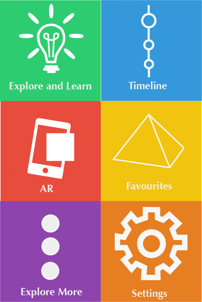
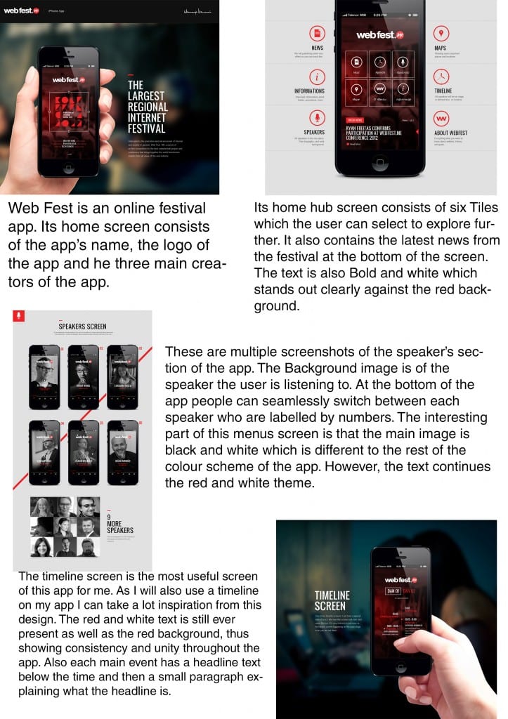
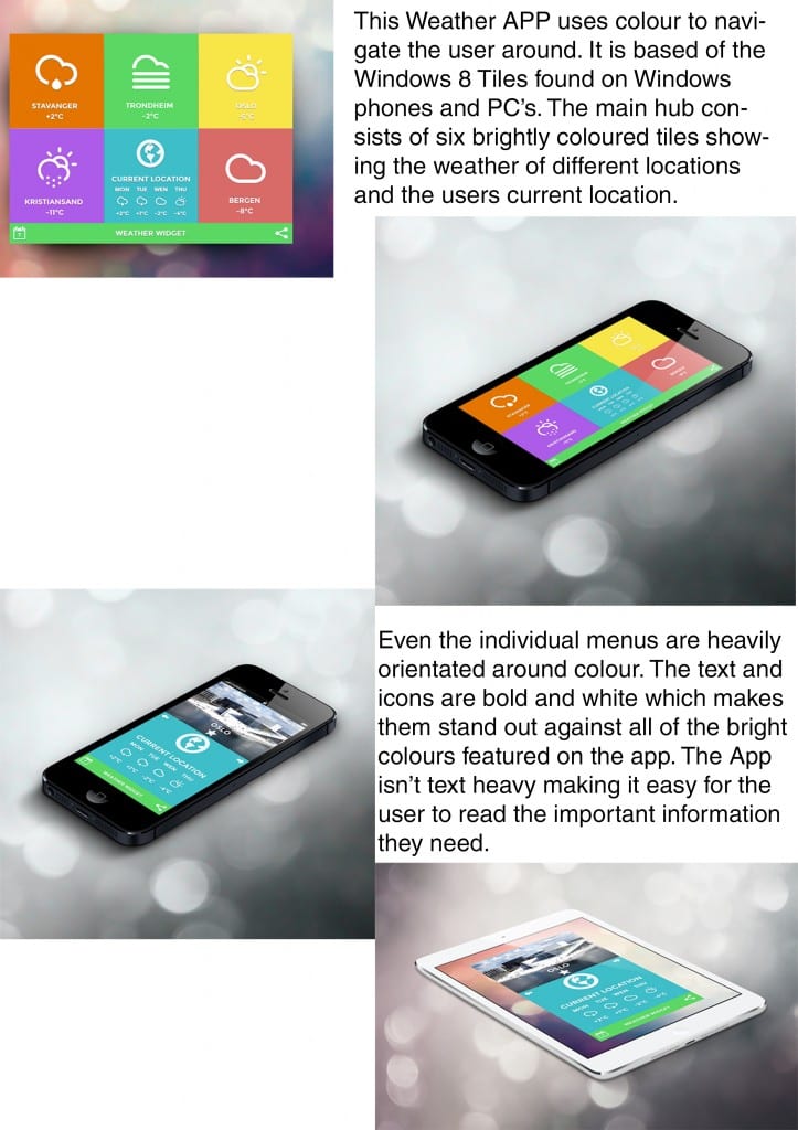
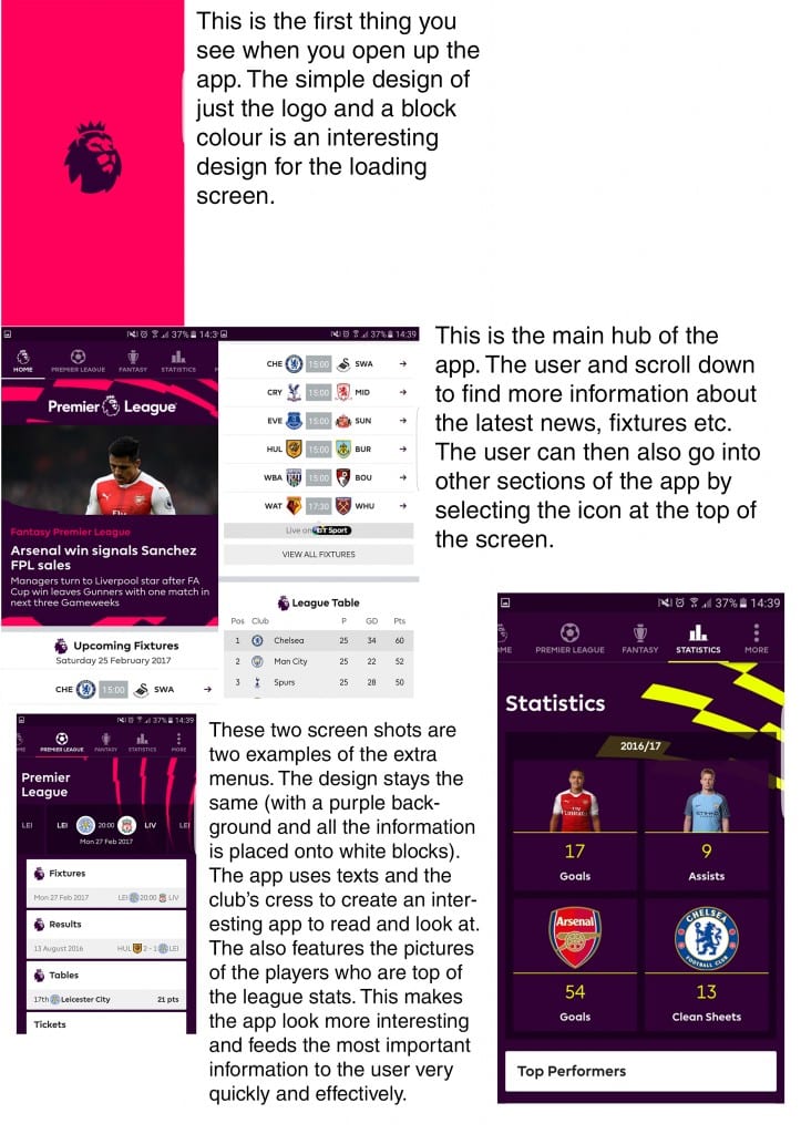
This design takes inspirations from the windows 8 colour theme. I really enjoy the use of multiple coloured tiles, as they make the app look interesting and bright. However this theme maybe suitable for the younger part of my audience but I feel that it may look to childish for the older part of my audience. Later on I will get audience feedback on this to see if my assumptions are true.
Monthly Archives: February 2017
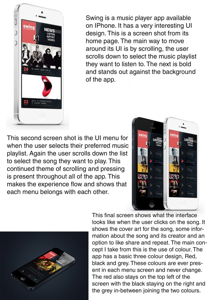
Looking at Current App UI Designs
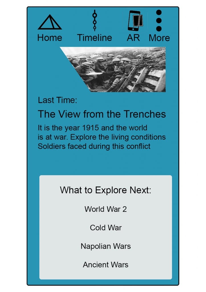
Initial Draft of App Home Hub
This is my initial idea of a home hub for my app. I really enjoy the icons at the top of the page, these icons make the menu look more interesting and fun instead of just standard text. The first tab showing what you last look at is also a favourite idea for me. It adds a more interesting dynamic to the page and also adds an interactive element to it. I will need to further this design but it is a good starting point. The bottom menu option needs some more work. I really like the two colour model that I have created. However more work is needed to make the colours contrast more and also make the menu merge into the app.
