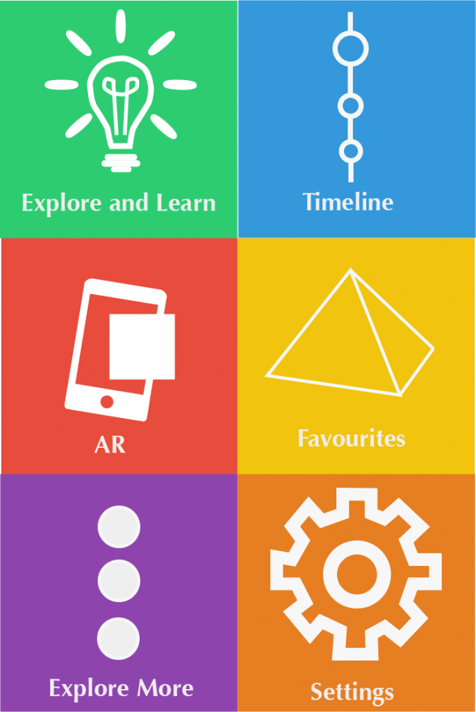
Due to audience feedback I did a couple of things to the design of this page. Firstly I have shrank three of the icons, the settings cog, the light bulb and the timeline icon. Now they look more contained in each tab which is good. Also I changed to font to Marker felt. This change has made the screen more eye catching and fun to look at which connotes with this design.
Author Archives: Ashley John Roberts
Some changes due to initial feedback
This is the second attempt at my favourites page. Nothing really has changed apart from where the yellow cuts of the picture and the moving of the 5 white dots to the centre of the page. Overall I am happy with the feedback for m two first initial designs. Now I will create a different version of the screens and see how they will look with a completely different UI.
Initial Feedback
Favourites Page and Home Hub feedback:
-Don’t have the yellow triangle cutting out to much of the image as you end up with a lot of dead space on the left of the screen. Also the triangle cuts to close to the text so just pull it back a bit more.
-Looks good. Simple, bold, colourful
-It’s cool. Say, simple easy as gets your attention. For 11 I think it’s really good. 16 might want something a little more subtle. I really like your favourites page
-I really like the design, it’s colourful and grabs your attention. It’s really clear and looks easy to use. I really can’t think of anything to change.
-I like the use of the symbols and the variation of colour. However the font is a little boring. I’m not saying have like a mad but maybe one that differs from Calibri or Aria. I also think the symbols need to be of a similar size. Because the light bulb has things around it that looks much smaller than the settings button and explore more button, so I would consider maybe just decreasing them a little.
-A small thing maybe shrink the settings cog a tad
Favourites page first design
This is the first design for the favourites page for my app. It combines both the simplistic icon’s and colour design and actual pictures. The last five lessons slide will have five images automatically transitioning between each other in a sliding motion. I really enjoy the look of the icons at the bottom of the screen, as they continue the theme of the simplistic design. However I don’t think the icons and the image go together that well. I will possible have to create big icon images to act as the menu slider. The only way to know if this screen fully works is to get audience feedback. /originally I did have a black gradient at the top of the page, however due to some feedback while designing this page I removed it as people said the gradient wasn’t needed. I also made the font bold so it stood out more against the background and image.
2nd Example of a UI Design
This design takes inspirations from the windows 8 colour theme. I really enjoy the use of multiple coloured tiles, as they make the app look interesting and bright. However this theme maybe suitable for the younger part of my audience but I feel that it may look to childish for the older part of my audience. Later on I will get audience feedback on this to see if my assumptions are true.


