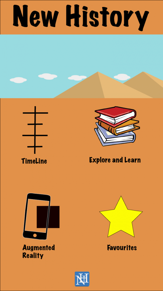
This UI design is aimed towards the young apart of my target audience. It incorporates with a cartoon and Icon look from my other UI designs. The top picture’s will show a range of cartoon images that swipe between each other (From the pyramids, to Colosseum, to Stonehenge and then to factories). The logo of the app is present at the bottom of the screen (this may be incorporated into all of my designs, depending on audience feedback). The colour of the background is a soft orange which I think suits well with the younger audience (again this could change due to feedback). Each button will take the user to the page that they clicked on, see the favourites page I designed earlier.
Author Archives: Ashley John Roberts
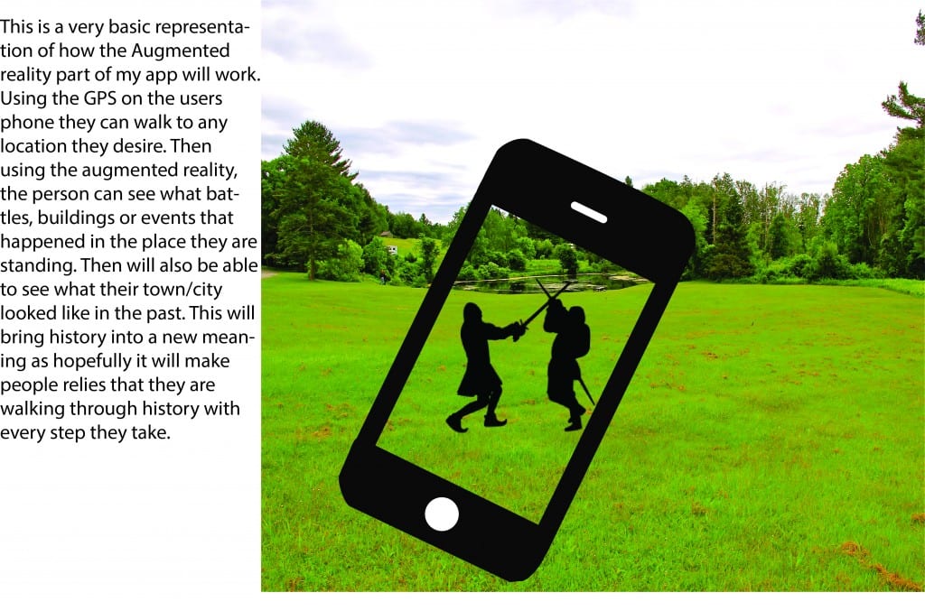
Augmented Reality Explained
Third favorites Page
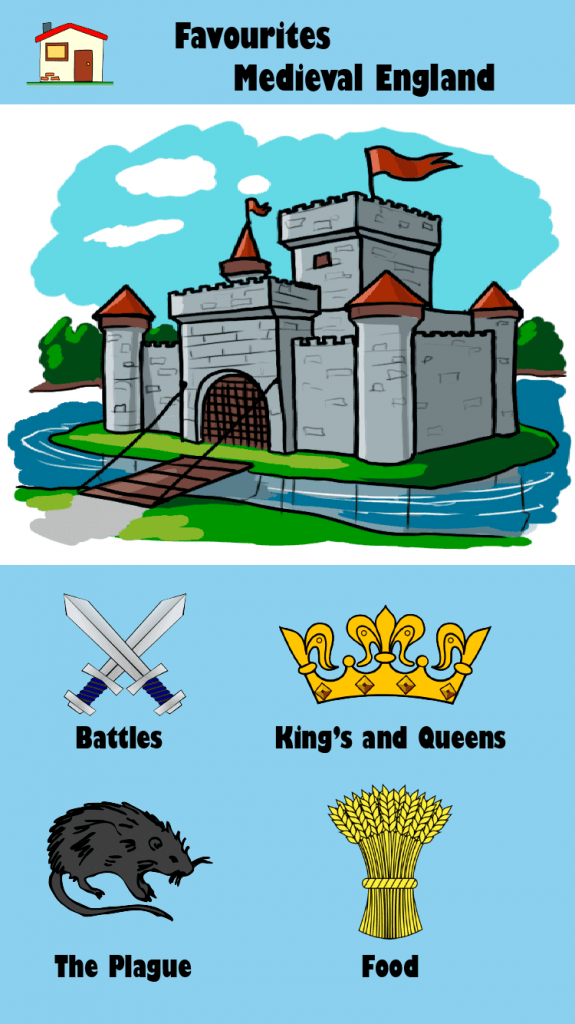
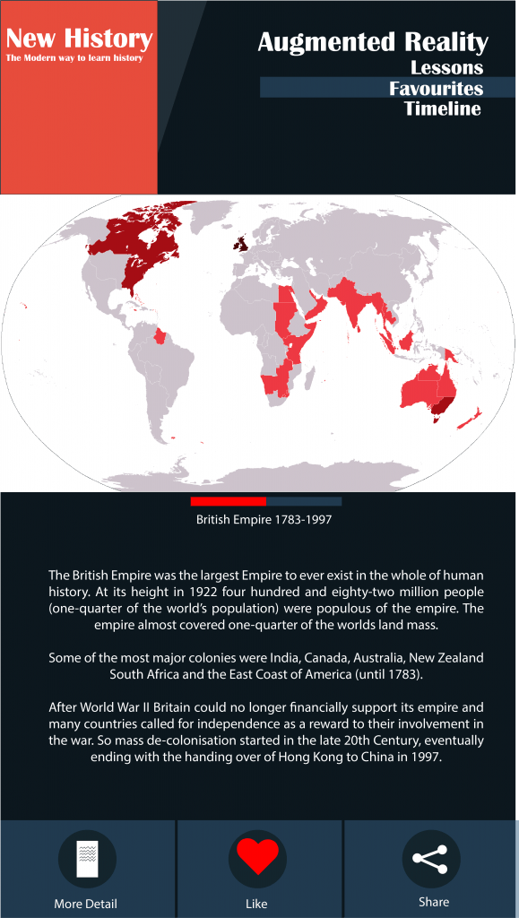
This UI design is my first attempt to create a UI solely focused on the younger part of my audience (11-13). This design is more picture focused compared to my other designs. This makes the page look more interesting to the younger audience, as pictures stand out more than text. The colour is also calm and bright which looks really good with the foreground images. The simplistic layout makes the app easy to follow and understand.
Second Favorite’s Page
An Idea!
Going through my designs I have encountered a problem. As the age group of my target audience is so broad, the demands that I need to meet to fit into this group is challenging. So from now on I will try to create two designs for my branding and UI designs. One design will appeal to the older part of my audience (14-16) while another will try to en-corporate the younger part of my audience (11-13). Even know ill be doing two designs their is nothing stopping the older part from using the younger version of my App and vise versa. Both versions will contain the same amount of information and creativity, but just put forward in different ways.


