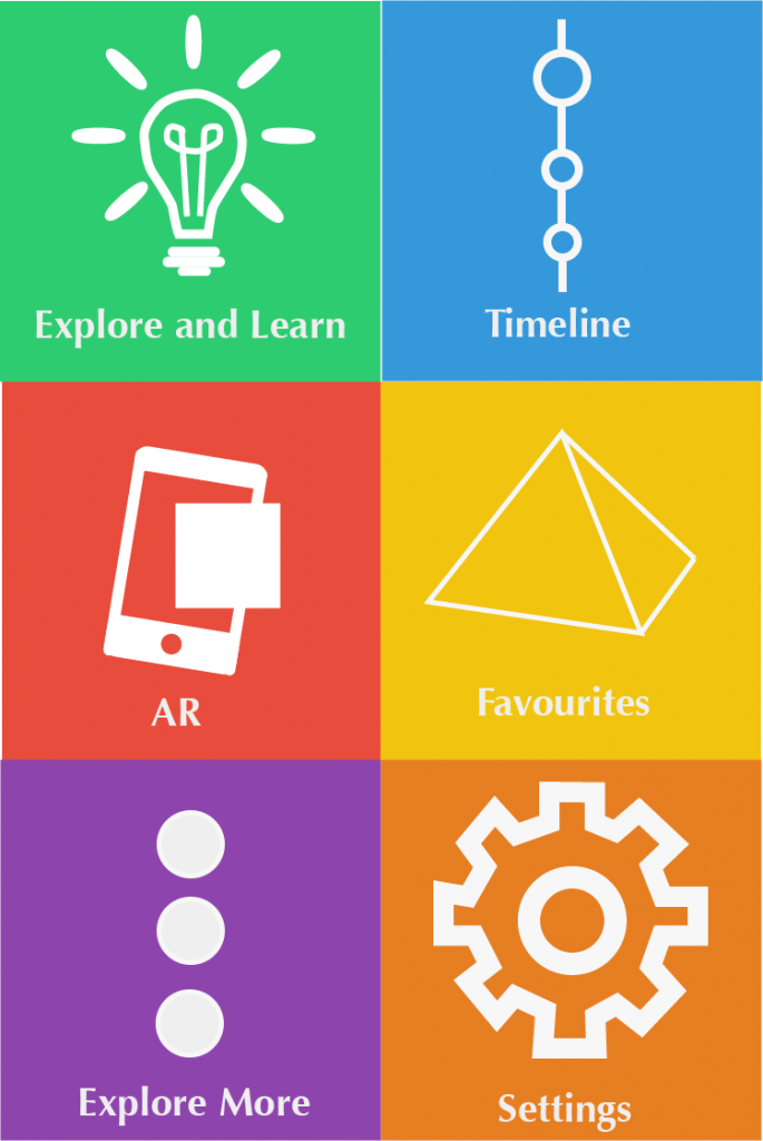
This design takes inspirations from the windows 8 colour theme. I really enjoy the use of multiple coloured tiles, as they make the app look interesting and bright. However this theme maybe suitable for the younger part of my audience but I feel that it may look to childish for the older part of my audience. Later on I will get audience feedback on this to see if my assumptions are true.
