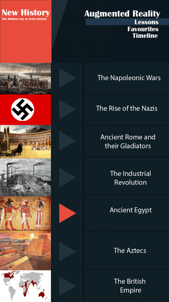
This is the main hub screen for the lessons section of my app. The user selects what topic they wish to study by clicking on the arrow next to the picture. This is the older design for my UI so the pictures are placed below each other with the topic info on the right of the screen.
