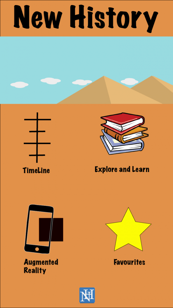
This UI design is aimed towards the young apart of my target audience. It incorporates with a cartoon and Icon look from my other UI designs. The top picture’s will show a range of cartoon images that swipe between each other (From the pyramids, to Colosseum, to Stonehenge and then to factories). The logo of the app is present at the bottom of the screen (this may be incorporated into all of my designs, depending on audience feedback). The colour of the background is a soft orange which I think suits well with the younger audience (again this could change due to feedback). Each button will take the user to the page that they clicked on, see the favourites page I designed earlier.
