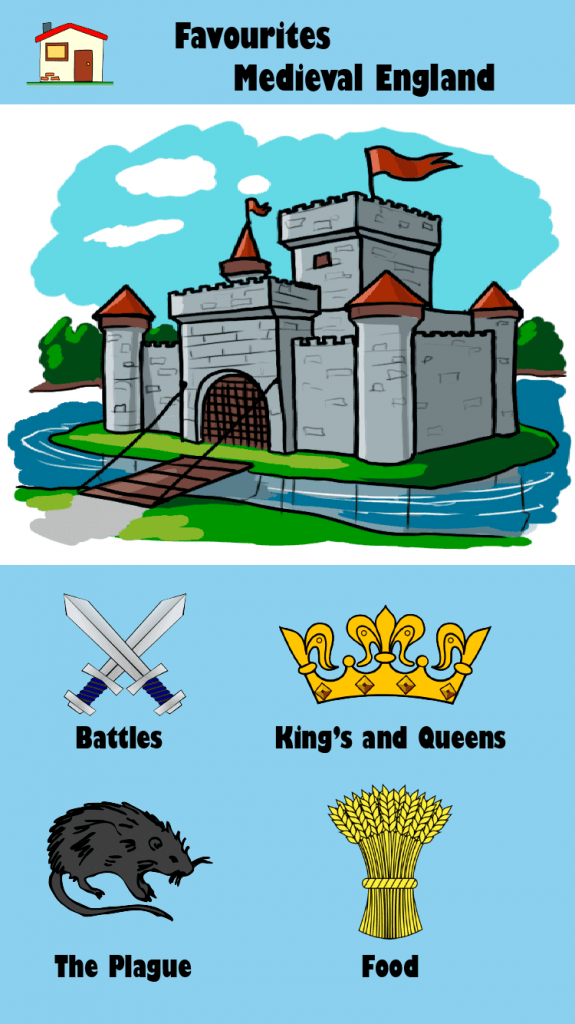
This UI design is my first attempt to create a UI solely focused on the younger part of my audience (11-13). This design is more picture focused compared to my other designs. This makes the page look more interesting to the younger audience, as pictures stand out more than text. The colour is also calm and bright which looks really good with the foreground images. The simplistic layout makes the app easy to follow and understand.
